Last Updated on December 30, 2025 by Craig Allen Keefner
Kiosk Self-Service Experience for the User
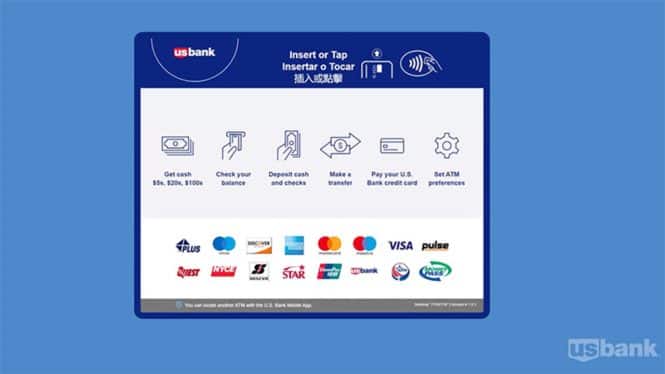
When a user approaches a self-service touchpoint or kiosk, the usual “highest denominator” user looks at the screen and decides what it want them to do. A typical opening screen on an ATM usually displays the bank logo prominently, a welcoming message like “Welcome to [Bank Name]” or “Insert your card,” and clear instructions to insert the debit/credit card into the reader, often accompanied by an arrow indicating the card slot; the screen background is typically clean and uncluttered, with easy-to-read font size and style.
Olea Kiosks has published their take on the Kiosk User Experience and offer many valuable insights into kiosk design and UI.
Some of our own pet peeves focus on mobile apps. Often clear presentation of information is superseded and overwhelmed by the “Special Deal of the Day”. When you call into Customer Service the first thing that should happen is a person answers but that is not what happens 95% of the time. First there are the preambles for disclosure and access, and then you must select from a first palette, and often a second palette to narrow down your request. Poor user experience is the result. Interface and ordering screens are the same.
One challenge facing public terminals like kiosks and ATMs for that matter, is to what degree and in what fashion will AI be incorporated. Many AI pilots in self-service fail because of a rush to get “try it” but having a poor dataset to work from. The underlying data comes first. How do you use AI in a self-order context to not only increase the sale but streamline it at the same time?
Excerpt:
We know kiosks are a proven solution for efficiency and convenience, but is your user experience keeping up? Even the best technology can fall short if it frustrates users or slows them down.
Look at the critical elements of kiosk user experience—everything from usability and design to the environment around your kiosks. This will remind you that great technology is only as good as the experience it delivers.
Read the full article and ensure your kiosk deployment is designed to delight.
Summary:
The article from Olea explains that successful kiosk user experiences hinge on three key elements: usability design, customization, and a strong focus on customer needs. By ensuring kiosks are user-friendly, tailored to specific industry requirements, and accessible to all, businesses can significantly improve customer satisfaction and streamline their operations.
Outline:
- Introduction
- Importance of kiosk user experience
- Key elements of success: usability design, customization, and customer focus
- Usability Design
- Importance of user-friendly interfaces
- Benefits of intuitive navigation and clear instructions
- Examples of effective usability design in kiosks
- Customization
- Tailoring kiosks to meet industry-specific needs
- Flexibility in software and hardware design
- Case studies of customized kiosk solutions
- Customer Focus
- Understanding customer behavior and preferences
- Accessibility features for diverse user groups
- Enhancing customer satisfaction through responsive design
- Conclusion
- Summary of key points
- Future trends in kiosk usability and customer experience

