Last Updated on November 30, 2025 by Craig Allen Keefner
Self Checkout Kiosks – a Look at Two

When Summit Research Associates began testing kiosks more than 20 years ago, many of the usability issues we encountered were attributable to the hardware available at the time. Kiosks allowing customers to create their own greeting cards, for example, depended upon pen-plotters to complete the task! (Affordable color laser printers had not yet been invented.) No wonder people got tired of waiting for their custom designs to be completed only to be exasperated by the quality of the finished card because the ink colors ran out unevenly.
Click for full size
Today, many of those deterrents are long gone. The power of the microprocessors running the kiosks have increased exponentially, the Internet is robust and reliable, people are no longer intimidated by keyboards and—because of the widespread use of smartphones and tablets—touchscreens are second nature to almost everyone.
Self-checkout kiosks in retail POS have been a long-established segment of the kiosk industry. First deployed at grocery stores, they are now a common sight at stores like Home Depot and Lowe’s.
Not all installations have been successful, though. IKEA pulled their units from all US-based stores several years ago because of constant failures, especially in the use of the hand-held scanner. This peripheral is a requirement when checking out the huge boxes containing many of the install-it-yourself products at the home furnishings chain. The tethered scanner was used to read the bar code but it was very fussy; customers either held the device too close to the bar code or too far away. The result: the item was not scanned successfully.
As a result, it was common to observe frustrated customers loading everything back into their shopping cart and finding another kiosk to use. The instructions on the touchscreen never provided even a hint as to where to place the scanner for successful “reading.”
In addition, IKEA did not give customers any choice; you either had to use the kiosks or walk away empty-handed. All the checkout lines consisted of a kiosk, with none staffed by a human being. They also had few store employees nearby to help confused customers complete their purchase.
Unfortunately, a number of kiosks deployed today continue to disappoint and frustrate users. What may look like hardware issues are actually software deficiencies. In this article we will look at two Self-Checkout kiosk deployments, illustrating one that is highly successful and one that is anything but. Because we have long seen that would-be kiosk providers and users will remember the failures far more often than the successes, we will devote the bulk of the discussion to that less-than-successful deployment.
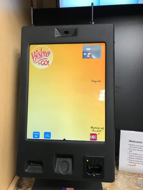
Johns Hopkins University self-checkout vending kiosk.
Bistro self-order – click for full size image
The Rockville, Md., campus of Johns Hopkins University consists of three buildings and shares space and parking with the National Institute of Health’s National Cancer Institute. A snack bar providing food such as hot and cold sandwiches, soups and beverages, chips, candy bars and other desserts was in operation for many years, but because much of the traffic flow was dependent upon the school schedule, it increasingly became a money-losing proposition and closed for good in Spring 2017.
Students and faculty were not pleased by this turn of events, complained frequently and resulted in management finally providing a solution.
Click for full size
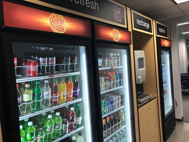
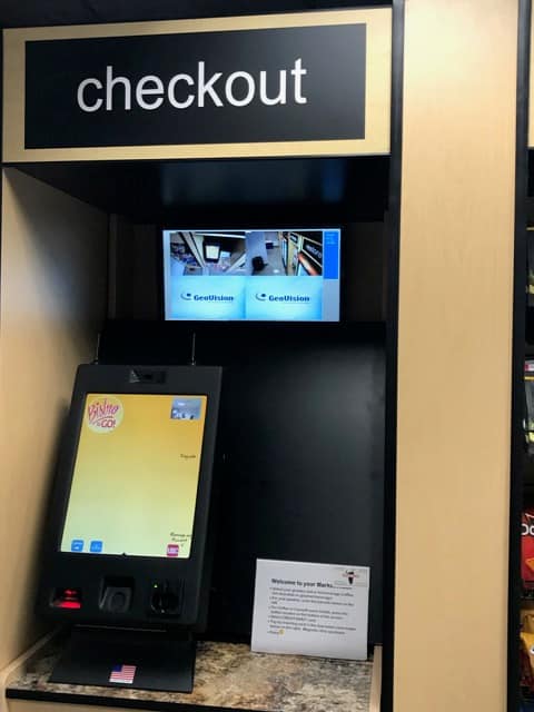
In October, Baltimore-based Black Tie Services installed a series of refrigerated units and shelving in an alcove just off the communal dining area in the main building (Gilchrist Hall) to provide much of the food previously available at the snack bar. Called Bistro to Go!, it allows people to select (mostly) snack food and beverages and pay at the kiosk located near the middle of the space. Black Tie Services is part of Accent Food Services, a national organization that primarily deploys “Micro Markets” and sells hot beverages.
The food and beverages are attractively displayed but there are no prices shown. Accent offers an App, USConnectMe™ at many of their locations that allows customers to pay for their purchases, earn points and add value with a special enrolled card similar to the popular Starbucks card. This is indicated by a square red button near the lower right corner of the touchscreen.
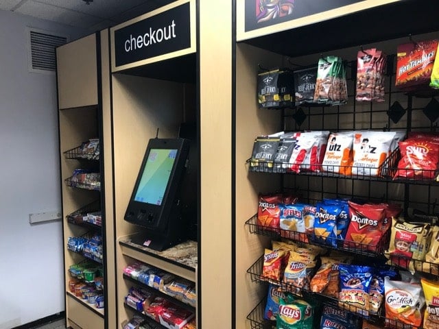
The developers expect customers to scan the products they are buying to determine the price. The entire success (and failure) of the kiosk depends on that scanner. Unfortunately, until customers “get the hang of it,” the scanner either does not recognize the UPC or it scans the same item repeatedly. There are no helpful hints on the large touchscreen showing customers how close they need to be to allow the scanner to read the bar code. The scenario is very similar to what prompted IKEA to remove its kiosks. Because of these scanner issues, it is common to see people waiting in line to pay for their food during busy periods.
Click for full size Checkout
There is a closed-circuit camera that (hopefully) keeps customers honest. Still, the struggle customers experience trying to get the scanner to recognize the items they are purchasing is likely to promote dishonesty–unless other people are waiting to pay and offer to help.
Click to expand
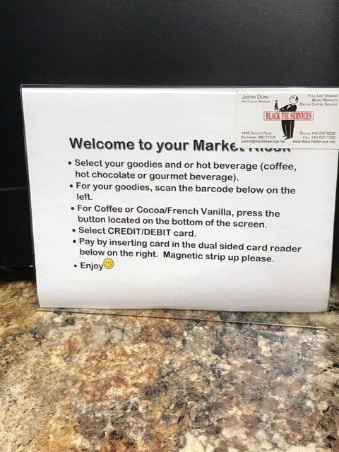
The kiosk sports a large (approximately 11×16-inch) vertically-mounted touchscreen. Yet it does not include How-To instructions. Instead, the developers have placed a rugged plastic sign on the counter listing all the instructions. This is foolish. What if someone were to (deliberately or inadvertently) remove the sign? Then customers would have no idea how to proceed Furthermore, the sign is too low to the ground, making it difficult to read for anyone not in a wheelchair.
Most people will try (repeatedly) to pay for the food they have selected. They will scan their food, which then appears on the screen as a running total, just as a grocery store kiosk works. A very loud voice informs the purchaser (and everyone else nearby) the items that are being purchased. They are then asked to “Select a pay method.” This is unnecessary because the only payment method is via credit card. 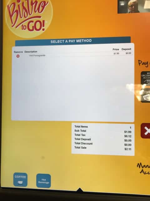
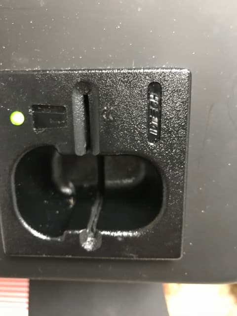
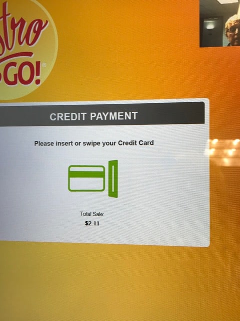
The customer is shown an illustration of how to insert their credit card. Now look at the photo of the credit card reader itself. Is it any wonder that people are confused? There is an icon on the reader itself but it is low to the ground and black-on-black is hard to read.
Click to expand
That aforementioned red USConnectMe button is also the cause of much customer frustration at this location. It doesn’t work but people touch it anyway. (In fairness to the customer: how do they know it doesn’t work?) Instead, a screenful of information about loading value on to the card appears which serves to further confuse students. And it dramatically adds to the time it takes for a student to complete his transaction; it is not at all easy to return to the previous screen. I personally witnessed longer (than usual) lines to pay when someone touched this button. The designers should adhere to our long-held rule: if a button is not relevant, REMOVE IT!
Click for full size CC
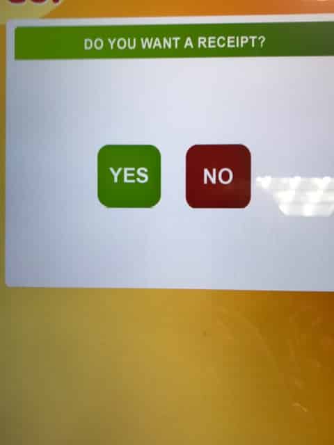
Finally, the customer is asked if he/she would like a receipt with large square buttons indicating Yes (green button) or No (red button). When I used the kiosk, I selected Yes, but never received the receipt. There was no way of knowing if the printer was out of paper or was simply malfunctioning.
Receipt – click for full size
Because of the many deficiencies listed, the kiosk leaves the user with an unpleasant taste (no pun intended) but if a student is hungry and has no alternative, they will put up with it and keep on trying until they are successful.
These micro-markets have the potential to resolve several problems in food services. None of the current usability issues are deal-breakers. Some common-sense software modifications should be made and will go a long way towards ensuring a successful deployment. Once the units are fine-tuned and made more user-friendly, they will achieve the desired results.
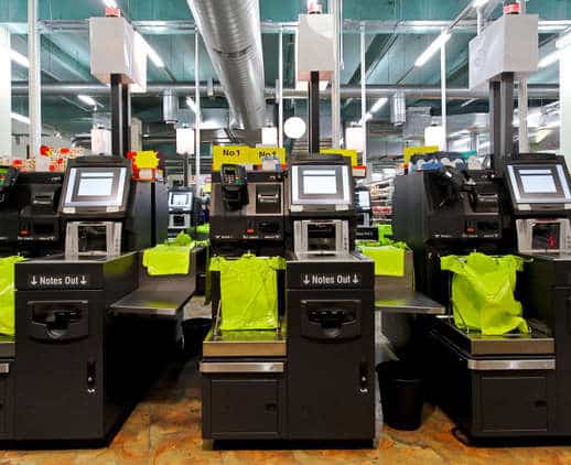
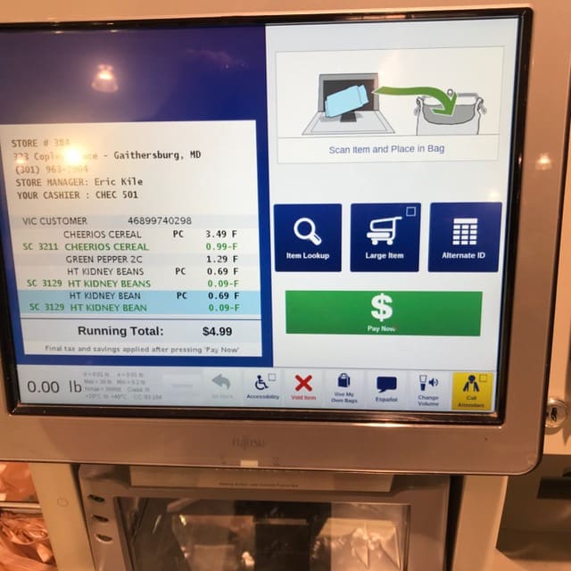
Harris-Teeter Self-Checkout Kiosks
Click to expand
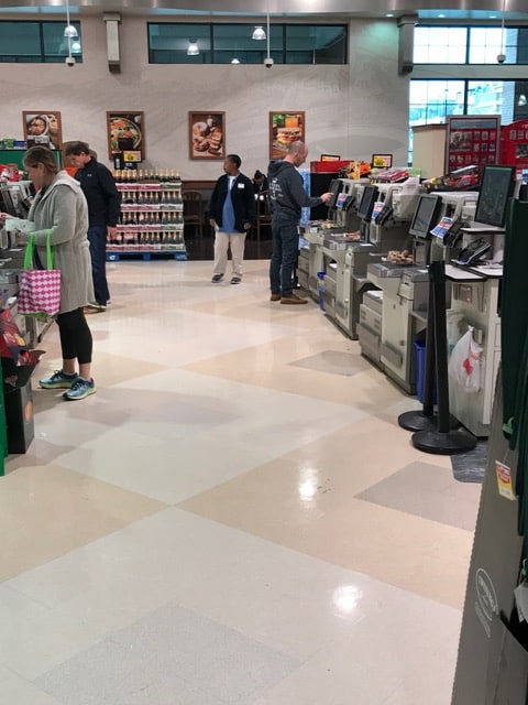
The self-checkout kiosks at Harris-Teeter supermarkets generally work well and shoppers frequently wait in line to use them, even when manned checkout lines are lacking any customers. The 245-store chain is a subsidiary of Kroger and has been making significant inroads in the Greater Washington, D.C. area. Even though there are no signs alerting shoppers to their presence, people enjoy the convenience and generally acceptable functionality of the devices and happily wait their turn to use one. The store features six units, with two banks of three facing each other. A full-time employee is stationed in front of one bank of units.

click to expand
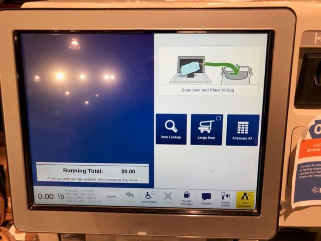
These types of kiosks will be familiar to anyone who has visited a grocery store over the past few years. They are fast, quite easy to use and do not require much in the way of instructions. The software interface is mostly self-explanatory. The scanner works exceptionally well and is infinitely more reliable than the small unit found on Bistro to Go!
Click to expand
The only problem? Sometimes the prices are incorrect, sale prices have not been updated into the system, and keying in the 4-digit code for produce can sometimes result in errors. These problems are almost always quickly resolved, thanks to the proximity of the store employee.
Click to expand
Payments are made at a separate unit located a few inches from the touchscreen and the well-designed images show how to scan or insert a credit card or pay with cash. The units are outfitted with several expensive peripherals, including the high quality/super-sensitive Toledo-Mettler scales embedded in the bagging area.
The importance of using high-end components can’t be stressed enough. These types of kiosks receive a tremendous amount of use and shoddy peripherals will result in inoperable units which quickly leads to unhappy customers. Whole Foods tried self-checkout units a few years ago but they failed so frequently that frustrated customers avoided them and the project was cancelled. It remains to be seen whether new owner Amazon will try deploying them again.
History has shown that the kiosk costs are more than offset by the number of employees the retailer no longer has to employ. Furthermore, customers love them and are convinced that the process is faster than if they had used a human checker. That is not true, but to quote an adage: perception is reality.
The past few years have shown just how popular self-checkout kiosks can be. Just make sure that they work consistently and do not cause customer unhappiness or frustration. Harris-Teeter has the winning formula. Bistro to Go! at Johns Hopkins could enjoy the same results with some fairly easy modifications.


